Summary
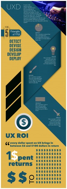
For this stage of the project, we are to refine our infographic with improved vectorized graphics and create a stylized graph or chart. I wanted to keep the graphics to compliment and be consistent with one another. So I used a philosophy of icons, but creating them in a bigger scale. I wanted to add a touch of color accents to them too, and chose to stick with the overall dominating color for it. I think it works perfect, as long as the vector graphics stay on the ribbon. I think there is a lot of refining to do however, i feel that my graph need a major change, to lure you to see the benefits of UX. I also need to work on some textual hierarchy and fix the radar so that the light source in it points downward 45 degrees, therefore leading your eyes to the next element.

