Summary
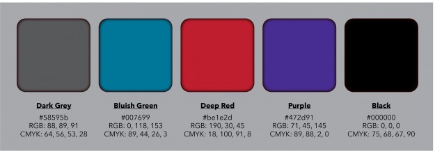
The purpose of this project was to transfer three of our favorite hand sketched logo designs to vector style based in adobe illustrator. I wanted to wanted to focus on a few different elements. One focusing on sharp symmetrical edges (1), another with a smooth circular movement(2), and finally one that is a combination of those elements(3).The only hard part was deciding what kind of colors I want to use. I usually stick with a set few that I like to identify with, but decided to go beyond that. I usually go with blue, but added red, purple, and grey to the mix. I used purple because of how it represents royalty and how this is about “me”. I used red to do a color a never really add to anything, and I think it turned out well.
Beyond Original
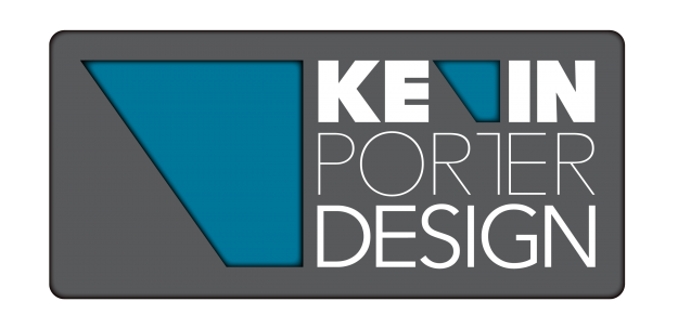
After doing the the three vectors we were to complete for this project, I went a little further because of how much fun I was having. I decided I might want to head a different direction and created this fourth logo, after many other variations of similar compositions of course. This might not be the one I used, but I feel that it expresses layers/depth with is kind of a symbol of a journey which portrays user experience.
